

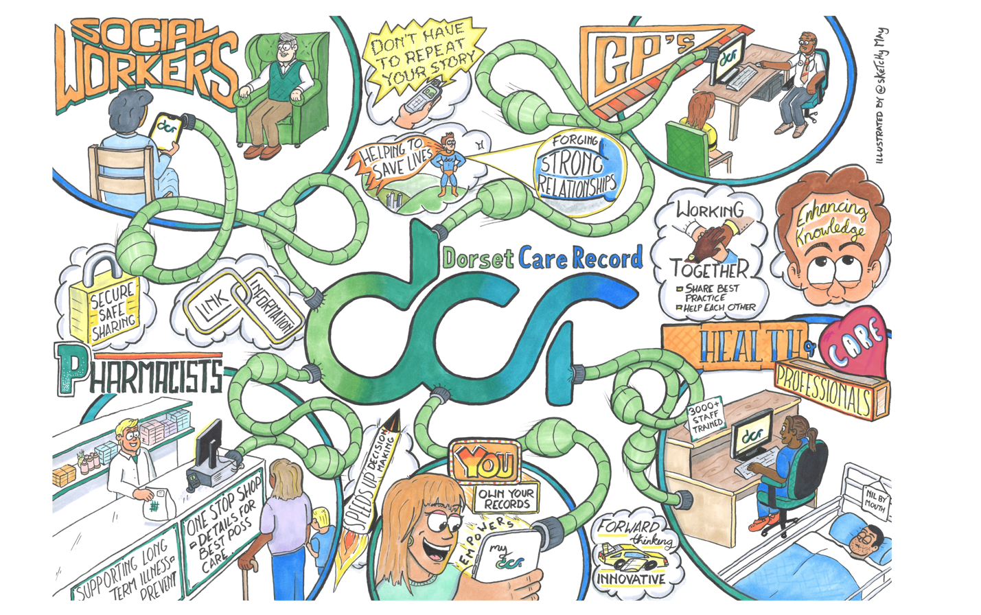
Alex May has been producing illustrations for teams across Dorset Council over the past few years. In our latest blog, Alex writes about his work and how he came to produce the diagram for the Dorset Care Record Partnership.
I began to draw “rich picture” process maps some years back (diagrams with images of the “thing” next to the words for the “thing”). I used these to help gain a buy-in and a greater understanding from my customers for pieces of work I was involved with. I worked closely, at the time, with DCR Business Analyst Jayne Catley, who introduced me to this format.
One thing led to another and soon I was producing sketch notes / graphic recording / illustrations regularly for not only my own but Corporate projects. I really enjoy the format and believe in the adage that “a picture speaks a thousand words” ……plus the hope is that, on some occasions, they allow me to avoid writing!
All my illustrations to date have been drawn freehand. This can, however, make the whole process very time consuming and if I mess something up…
You want me to do what?!
When I was approached by Tony McDougal (DCR Communications and Engagement Officer) asking if I would be happy to create an image for DCR I was delighted. I’ve been aware of the project from its inception and have been envious of what it’s achieved. As a Service Designer for the Council (the day job) my daily focus is around user centred design and this is a brilliant example of just that. I can relate to the scenario of going through the rigmarole of repeating your story when people are ill or moving from or within health care settings.
The DCR delivers a safe and secure way for professionals to find out the information required and share to other authorised professionals in different settings in a safe and secure manner too negate this repetition. It is an invaluable resource.
Research, research, research
Following our initial conversations, Tony shared with me a list of phrases and key words generated by the team covering what DCR encompasses and means to them. I later attended a Team meeting to introduce myself, describe my processes, gather ideas on any possible design themes and to collect further comments from them around the strengths and benefits of the product. With all this and information captured through reading publications and online resources I drew up a few possible overarching designs for the illustration.
I delivered to the team 3 “post-it” sized sketched options with written descriptions and example imagery whereby they voted for their favourite. It’s likely the service designer in me is magnetised to Post-its but I find they limit the amount of detail I can go into/be more concise.
The Team chose the option which visualises clearly the connections to all who have access to the DCR symbolising the 2-way sharing of information, with the benefits scattered around the piece.
Pencilling in
Once the layout design had been chosen, I set to work generating the 1st draft. I brought together all the information captured, highlighted the key points, noted any themes, and grouped where possible ensuring along the way that they gave an accurately reflected DCR. I then roughly sketched out an image to help describe each point. Once done I set about thinking how these could be incorporated into the layout design to make it flow as much as it can.
Due to the design chosen and the imagery planned I had to go big i.e. A3 in size. This allowed ample space to reduce overcrowding. I began by drawing rough circles around the page to map out where the individual illustrations were going to sit, this allows me to check the spacing and sizing. Once happy I laid down the pencil design starting from the central large DCR logo and working my way outwards.
Time for a quick review
On completion of the pencil draft I shared it with the team requesting their comments to ensure I was on the right track. Following their feedback, I made some slight amendments (always good to check before getting the permanent ink out).
The point of no return
Next step was inking. For a piece so large it can be time consuming but is ultimately one of the most important, enjoyable but stressful parts, bringing the image alive. Throughout this I’m thinking about the thickness of the lines, styles to use, type used, shapes and colour scheme, altering and adding as I go. The colours chosen were that of the DCR logo and with contrasting colours where there was a need to highlight certain aspects such as the titles of Professionals etc.
On its completion I scanned the image, digitally cleaned it, sent to Tony, done!
My final thoughts
I’ve spent many nights agonising over this illustration in my studio/shed. I am happy with the outcome I just hope that the amazing DCR team are too. Not forgetting most importantly, that it captures what the DCR is and highlights the huge benefits/impact that it delivers to the lives of the people of our county.
Alex May (@SketchMay)